 |
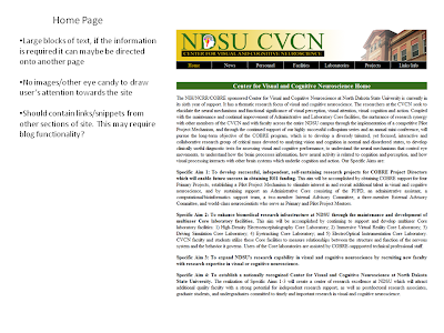
| Example Critique Sheet for the Home Page |
The current site, as I talked about in the previous post, contains a lot of information. It is written at an academic level, which projects a sense of professionalism and intelligence - however, I'm wondering if maybe this makes it difficult to read at times. I will have to check with the department to see how much of this information is even up to date, and what all should be added or moved beyond that.
There isn't a lot in place for pictures, or other visual elements. The banner across the top contains a logo for the department, but I'm not sure if I will keep it for the redesign. As it stands, it isn't very effective at communicating the meaning of the site. The font is default Times New Roman and isn't easily readable. Depending on the new design, I might consider changing to a sans-serif font.
The Potential of a New Design
I will probably be spending several days (if not more) looking at and analyzing elements to incorporate into the new design. Right now the questions I'm trying to answer are fundamental to the purpose of what this new site should do.
- What is the purpose of the new site? To inform, educate, advertise, etc. ?
- What words would describe this website?
- Academic
- Professional
- Edgy
- Smart
- Clean
- Practical
- etc.
- Who is the audience for the site?
- How dynamic is the site? How often will it be updated, and by who?
A lot to consider, and while I start to gather how much of the content is changing, I'll also be considering possible answers to those questions.
No comments:
Post a Comment